
GAIA
Creative Direction, Visual System
OVERVIEW
GAIA is a cut-and-sew clothing brand rooted in identity and intention. The objective was to develop a refined visual language that aligned with its elevated direction while preserving cultural authenticity. Every element was built to communicate clarity, control, and confidence.


OBJECTIVE
GAIA sought to refine its visual presence while remaining rooted in its core narrative. The brand was built around identity, intention, and self-awareness, and the visual language needed to reflect that depth with clarity and control.

CREATIVE DIRECTION
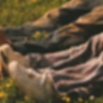
Our role was to translate the brand’s story into a structured visual system. Rather than imposing an external aesthetic, we aligned lighting, tone, and composition with the emotional weight of the narrative.
Muted color grading, controlled shadows, and intentional framing allowed the imagery to communicate maturity without losing authenticity.
Every image was built to support the story, not distract from it.

EXECUTION
The visual system was executed through structured production and controlled aesthetic decisions.
Lighting was kept deliberate and consistent to avoid distraction. Composition emphasized space, posture, and presence rather than trend-driven styling. Color grading was muted and balanced to preserve tonal depth while maintaining cohesion across all deliverables.
Photography and short-form visuals were developed simultaneously, ensuring continuity between static imagery and motion content. Every asset was created with long-term positioning in mind rather than short-term engagement metrics.
Deliverables included:
• Creative Direction
• Campaign Photography
• Short-Form Video Content
• Visual Consistency Framework
• Content Styling & Set Direction


IMPACT
The refined visual system strengthened GAIA’s perceived maturity and brand presence.
Through structured imagery and cohesive tone, the brand shifted from expressive concept to elevated identity. The updated visuals aligned the brand’s narrative with a more confident and controlled market position.
Rather than simply generating content, the project established a foundation for sustained visual consistency — enabling future campaigns to build upon a defined aesthetic direction.
Strong brands are not built through volume.
They are built through clarity.
